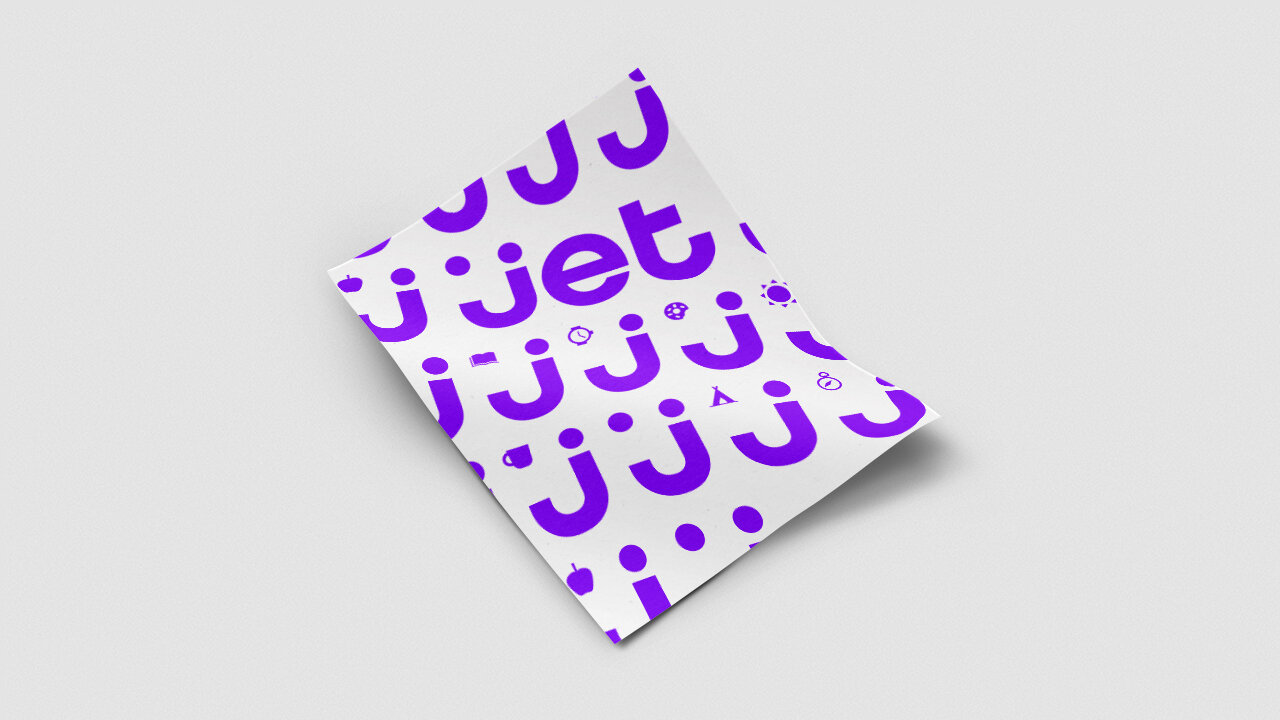
Shaping the Jet.com brand.
With its rapid growth, national expansion and a new employees being onboarded daily, Jet.com began to lose its brand identity. It was becoming like every other major eCommerce retailer out there. It was becoming a commodity—not a brand. To set the stage for the next phase of growth, Firstborn was brought in to codify the brand across all touchpoints, from the UI to the lowly but effective direct mail.

Background
As Jet was preparing for their next growth stage, they found that their brand identity was becoming scattered and disjointed across their many customer touchpoints. From product photography to tone of voice documentation, we armed Jet with the building blocks to create a robust, consistent and fluid brand system that works across all mediums. One of the major challenges with this rebrand was the range of content types we needed to consider—many of which were “unsexy” product shots of common household goods that needed to be elevated simply and quickly, no matter where the asset originated. We also partnered with DaltonMaag and created a custom typeface specifically for Jet. This new typeface works perfectly across both print and screen while maintaining the spirit and energy of the brand—and, at the same time, enhancing legibility. Developing the typeface not only created an ownable element for the brand’s aesthetic, but saved the company hundreds of thousands of dollars a year in licensing fees.


Bespoke typography actually saves money. We worked with Dalton Maag to create a unique typeface inspired by Gotham.
Exploring brand voice through conversational commerce for grocery specific user flows in native applications.


Content and ephemera.


